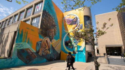
Image Card 1
Lorem ipsum dolor sit amet, consectetur adipiscing elit. Nullam in metus vitae ex condimentum molestie. Phasellus at dolor cursus, tristique justo eu, vestibulum arcu. Vivamus.

Alternative Home
This is the demo page for the Alternative Home content type.
• Basic Hero
• Feature Hero
• Full Width Hero
• Homepage Hero Carousel
• Swoosh Hero
This page template has multiple hero options and offers many components suited for homepages.
| Content Discovery | Interactive & Media | Text & Navigation |
|
|
|
Browse the demo components below to learn more about this content type.
50/50
The 50/50 is a basic building block for webpages. This component uses the full width of the page to showcase text on one half of the page and a large image or ambient video on the other half.

50/50 (Ambient Video)
The 50/50 is a basic building block for webpages. This component uses the full width of the page to showcase text on one half of the page and a large image or ambient video on the other half.
Description & Card Carousel
Description & Card Carousel displays up to three content items at a time with optional arrows to rotate through additional sets of content.
Description & Image Cards
Description & Image Cards displays content in two sections. The right side is organized as two columns of image cards that scroll within the component, while the left side displays header text and description.
Image Card 1
Lorem ipsum dolor sit amet, consectetur adipiscing elit. Nullam in metus vitae ex condimentum molestie. Phasellus at dolor cursus, tristique justo eu, vestibulum arcu. Vivamus.
Image Card 3
Lorem ipsum dolor sit amet, consectetur adipiscing elit. Nullam in metus vitae ex condimentum molestie. Phasellus at dolor cursus, tristique justo eu, vestibulum arcu. Vivamus.
Image Card 2
Lorem ipsum dolor sit amet, consectetur adipiscing elit. Nullam in metus vitae ex condimentum molestie. Phasellus at dolor cursus, tristique justo eu, vestibulum arcu. Vivamus.
Image Card 4
Lorem ipsum dolor sit amet, consectetur adipiscing elit. Nullam in metus vitae ex condimentum molestie. Phasellus at dolor cursus, tristique justo eu, vestibulum arcu. Vivamus.
Featured Summaries
Featured Summaries displays content in rows of three blocks. Each block contains a heading, description, image, and optional link.
Image Card 1
Lorem ipsum dolor sit amet, consectetur adipiscing elit. Nullam in metus vitae ex condimentum molestie. Phasellus at dolor cursus, tristique justo eu, vestibulum arcu. Vivamus.

Image Card 2
Lorem ipsum dolor sit amet, consectetur adipiscing elit. Nullam in metus vitae ex condimentum molestie. Phasellus at dolor cursus, tristique justo eu, vestibulum arcu. Vivamus.

This article can be displayed on pages using various news display components or the Feature: Internal Content component. When using the 'Headline Only Hero', make sure to add a Promotional Image. Promotional Images will display when an article is viewed inside components or on news listing pages.
Facts & Figures
Facts & Figures displays statistics and other key pieces of information with bold text, optional button style link and background color options.
News Display

This article can be displayed on pages using various news display components or the Feature: Internal Content component.
Filtered News Display

Featured Internal Content TEST SUMMARY
This is some descriptive text with bold, italic, super, and subscript, and a hyperlink and a bookmark.

This is some descriptive text with bold, italic, super, and subscript, and a hyperlink and a bookmark.

This is some descriptive text with bold, italic, super, and subscript, and a hyperlink and a bookmark.

This is the required summary field bold italic super sub bookmark hyperlink

This is the required summary field bold italic super sub bookmark hyperlink

This is the required summary field bold italic super sub bookmark hyperlink

This is the required summary field bold italic super sub bookmark hyperlink
Events Display

Saturday, March 19, 2050, 11:00 a.m.-12:00 p.m. | Location name displays here, New Brunswick
Sunday, June 19, 2050, 11:00 a.m.-12:00 p.m. | Location name displays here, New Brunswick
Full-Width Video
optional description


Social Media
Follow Us