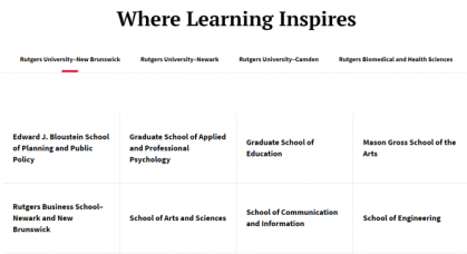
Components
Components are visual building blocks with unique features to display and organize content and media.
About Components
• Many components offer various color, layout, and link style options. Refer to examples and documentation to learn more.
• Sets of components are used inside content types (page templates) to create engaging webpages.
• Component display and style may change depending on screen size. Use the web browser to preview your page with different screen sizes (e.g. mobile, tablet, desktop).
Description & Card Carousel

About
Description & Card Carousel displays up to three content blocks at a time with optional arrows to rotate through additional sets of content.
Useful Tips
- You can create new content or curate existing Article and External Content entries.
Live Examples
Description & Image Cards
About
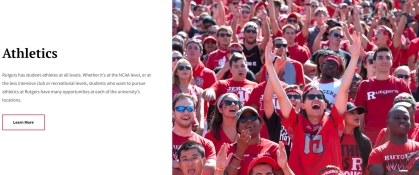
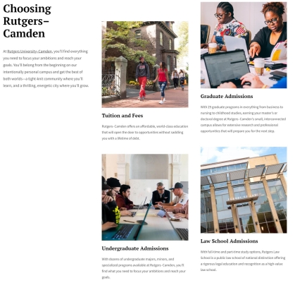
Description & Image Cards displays content in two sections. The right side is organized as two columns of image cards that scroll within the component, while the left side displays header text and description.
Live Examples
Description & Summary Cards
About
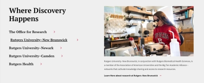
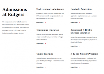
Description & Summary Cards displays content in two sections. The right side is organized as two columns of text content with links (no images), while the left side displays header text and description.
Live Examples
Enhanced 50/50
About
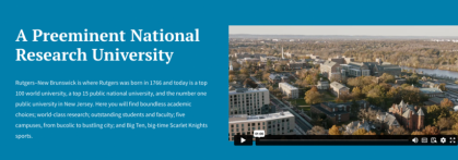
Enhanced 50/50 (e50/50) is modeled after the standard 50/50, using half of the component width for text and the other half for a visual element. Additionally, the e50/50 can display public videos hosted on Vimeo or YouTube (unlisted or private will not display), as well as Lottie animation files.
Useful Tips
- The e50/50 is intended to display video content and renders videos in the horizontal 16:9 aspect ratio. Images do not display correctly in the e50/50 - Please use the regular 50/50 component for static images.
- Videos embedded into an e50/50 will display the default thumbnail image from their source (i.e. whatever is chosen on Vimeo or YouTube).
Live Examples
Featured Summaries
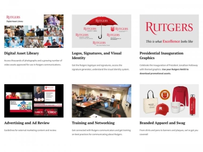
About
Featured Summaries displays content in rows of three blocks. Each block contains a heading, description, image, and optional link.
Useful Tips
- You can create new content or curate existing Article and External Content entries.
- When used on the Mini-Site or Article content type, this component displays content in a vertical column.
Live Examples
Heading & Description
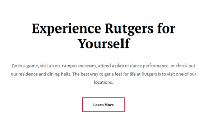
About
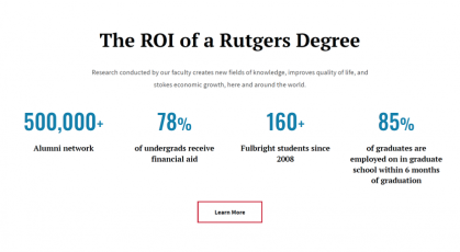
Heading & Description has a bold header text, description, large button style link, and optional color backgrounds. This component is great for page introductions, section headers, or information dividers.
Useful Tips
- The orientation field can be set to Vertical, Vertical-animated, or Horizontal to give this component a different layout.
Live Examples
Link Grid
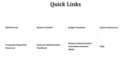
About
Link Grid creates a grid of bold links in rows of four. Optional background images can be used per link or for the whole grid.
Live Examples
Rich Text
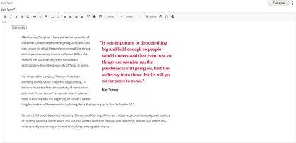
About
Rich Text is a versatile WYSIWYG (What You See Is What You Get) component that can be used to format and style text, insert links, create tables and lists, embed images and videos, find and replace text, and more.
Useful Tips
- If copying text from an external source into the Rich Text component, it's a good practice to paste as plain text (Crtl+Shift+V on Windows and Command+Shift+V on Mac) to ensure any unwanted formatting and/or artifacts are not carried over.
- Regular links can be styled as inline buttons by highlighting your link text, clicking the edit icon, and toggling the inline button switch.
- To create a block quote with bold red text (as seen in the example below), click the quotes icon and fill out the required fields.
Live Examples
Sticky Promo
About
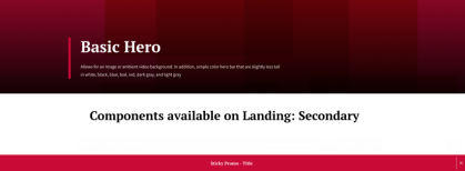
Sticky Promo creates a persistent button style link that "sticks" to the bottom of a page while users scroll. This component has color options and page visitors can opt to close the sticky promo by clicking on the marked "x".
Live Examples
Transition

About
Transitions are geometric components that can be used with other components to add visual flair to your page. By adding transitions with various colors above and/or below your components, you can alter certain components' visual appearance.
Live Examples
About Heroes
• Page heroes appear at the top of webpages and provide a heading for the page's intent.
• Content types have associated hero styles. Refer to the examples and documentation to learn more.
Basic Hero

About
The basic hero is the most common hero style in the RCCL. This hero can display an optional description, background image, remotely hosted ambient video, or a solid color background.
Useful Tips
- Ideal dimensions for basic hero images are 2,100 x 1,400 pixels with 72 dpi.
- Images in the basic hero are constrained to primarily display the center of images. Keep this in mind as you are choosing hero images.
- Available on Alternative Home, Landing: Secondary, Mini-Site, and Chaptered Page content types.
Live Examples
Full Width Hero

About
The full width hero provides an immersive space to introduce your page. This hero can display an optional image, ambient video, and description.
Useful Tips
- Available on Alternative Home and Landing: Marketing content types.
Live Examples
Full Width Hero Carousel

About
Full Width Hero Carousel is designed to introduce the news section of your website. This hero contains multiple "hero carousel cards" that display existing article entries. Users can scroll through the content by clicking the navigation arrows. Available only on the Landing: News content type.
Live Examples
- Example 1 (top of page)
Hero - Swoosh

About
The swoosh hero provides a unique and stylish way to introduce your page. This hero displays a background image, optional description, and a red or white "swoosh" that curves down the hero space.
Useful Tips
- The "swoosh" design element covers the left portion of your image. Keep this in mind as you are choosing hero images.
- Available on Alternative Home and Landing: Informational content types.
Live Examples
Homepage Hero Carousel

About
Homepage Hero Carousel is designed to display a set of curated news articles. This hero contains multiple "carousel cards" that display existing article entries. Users can scroll through the content by clicking the navigation arrows. Available only on the Alternative Home content type.
News Heroes

About
There are a few hero options for news and article content. Refer to the live examples below to see them in action. Available only on the Article content type unless otherwise noted.
Live Examples
- Feature Hero (Available only on the Alternative Home and Feature Article content type)
- Hero - Headline Above Image
- Hero - Headline On Image
- Hero - Headline Only
Cost Component
About
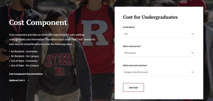
Cost Component provides an interactive experience for users seeking undergraduate cost information. This component requires four cost entries for each desired school/location to cover the following cases:
• NJ Resident - Commuter
• NJ Resident - On Campus
• Out of State - Commuter
• Out of State - On Campus
Useful Tips
- To create cost entries for this component, go to
Content > Costsin the content management system. - To create location entries, go to
Structure > Taxonomy > Campus Locationand enter your location taxonomies.
Live Examples
- Example 1 (see "cost of attending Rutgers")
Enhanced Photo Gallery

About
Enhanced Photo Gallery displays a set of images and remotely hosted videos in various visual layouts. Each media item can be clicked to view a fullscreen version with optional description and links.
Useful Tips
- The lightbox feature enables fullscreen media upon click. If unchecked, media items will display but without the fullscreen option.
- After adding media, choose different Gallery Types to change the layout of the items. Available gallery types include Grid, Masonry, Justified, and Slider.
- The Slider gallery type provides a slideshow experience with arrows to navigate media items. Please note that the fullscreen lightbox feature does not apply to the slider gallery type.
Live Examples
Featured Video
About
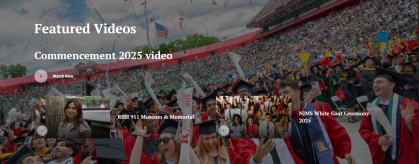
The Featured Video component is a way to showcase several videos within a single container. Set a background image and a primary video to take the main space, and up to two secondary videos to accompany your selection.
Live Examples
Full-Width Image
About
Full-Width Image displays a static image with an optional caption that spans the width of the screen.
Live Examples
Full Height Video
About
Full Height Video displays a remotely hosted video with an optional headline and description. The component spans the full width of the screen but is constrained by the height for an ideal user experience.
Useful Tips
- Videos must first be added to the content management's media library as Remote Videos before they can be used inside this component.
- It is recommended to use Full Height Video and avoid the older Full Width Video. The updated Full Height Video fits on a user's screen and provides a better user experience.
- Poster images can be added in the media entry's editing screen. Poster images display inside the component before a user presses play.
Live Examples
Location Map
About
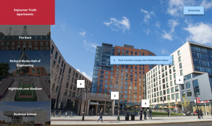
Location Map provides an interactive visual experience with optional numbered pins that can be clicked to view additional images, videos, and descriptions.
Useful Tips
- Each location corresponds to an image selection on the left side of the component. Within each location, "slides" can be added to provide additional media and descriptions about specific parts of the image.
- Each slide corresponds to a numbered pin that can be placed on the location image by clicking on the desired parts of the image inside the content editor.
Live Examples
- Example 1 (bottom of the page)
Photo Feature: 2-Column
About
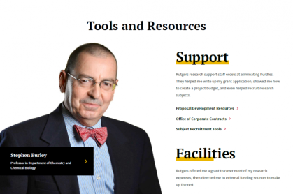
Photo Feature: 2-Column displays a prominent image and bold content as users scroll down the component. This component has text and links on one side and an image with a caption area on the other side.
Live Examples
Program Finder
About
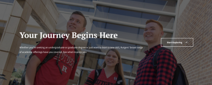
Program Finder provides an interactive link experience. This component uses the Program Type content type to create a multi-step user flow with guided links.
Useful Tips
- When adding this component to a page, you can create new Program Types on the page edit screen or use existing Program Types created beforehand.
- Each program type entry can contain a set of links or a single link. If opting for a single link, make sure to check the single link box.
Live Examples
Rollover Photo Grid
About
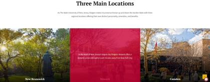
Rollover Photo Grid displays images prominently in rows of 3 with an optional title, description, and link. Each image can be hovered to reveal associated content with a red overlay.
Useful Tips
- This component is best used with multiples of 3 images (e.g. 1,2, or 4 images will not look visually pleasing)
Live Examples
Slideshow
About
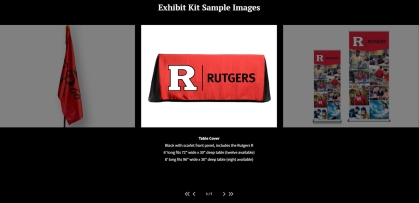
Slideshow displays a set of images with optional descriptions. Images can be viewed one at a time by navigating with the arrows at the bottom of the component.
Useful Tips
- Only one slideshow component can be used on a single page.
- The black background comes standard - There are no other color options.
- The Enhanced Photo Gallery is a more flexible alternative to this component.
Live Examples
- Example 1 (bottom of page)
Social Media
About
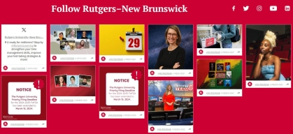
The social media component displays a social media feed that must be setup and managed on Curator.io, a third party social media aggregator. While the free version of Curator is enough to get started, users are encouraged to purchase the professional level to take advantage of advanced features.
Useful Tips
- Optional icon links can be added for Facebook, Twitter (X), YouTube, Instagram, and LinkedIn.
- Curator will generate a code snippet for your social media feed that must be pasted into the component to display your feed.
- To address accessibility concerns, it is advised to do the following on Curator when setting up your feed:
- Use the "Waterfall > Havana" feed style
- Turn off the "Load More" button
- Change the icon and link color to black
Live Examples
- Example 1 (bottom of page)
User Choice Carousel
About
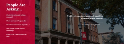
User Choice Carousel displays up to five content entries with large images and button style links. The left side lists the content headings while the right side displays associated images and description.
Useful Tips
- To create and manage content entries for this component, go to
Content > Questionsin the content management system. While the content entries are labeled as Questions, any type of content can be created. - This component is ideal for Q&A / seasonal content but can be used in creative ways to display any type of content.
Live Examples
Chapter Tab & Chapters
About
Chapter Tabs are ideal for organizing content into sections with navigation tabs. Available only on the Chaptered Page content type.
Useful Tips
- Each tab has associated menu chapters on the left side which include a set of components.
- Both tabs and chapters can be used as anchor links to specific parts of the page.
Live Examples
- Live Example 1
- This page utilizes the Chaptered Page content type.
Enhanced Secondary Navigation

About
Enhanced Secondary Navigation provides a "sticky" menu at the top of a page that remains visible as users scroll down. The arrow icon can be clicked to expand the menu to display additional navigation links.
Useful Tips
- To create a reusable secondary navigation, first create an entry in the Paragraphs Library located at
Content > Paragraphsin the content management system. Next, add the navigation component on a page's edit screen by selecting +From library under the Secondary Navigation section. - If a reusable secondary navigation is not needed, select +Enhanced Secondary Navigation on the page edit screen and build the component. In this case, the component can only be managed on the page it was created.
Full HTML
About
Full HTML has the same functions as the Rich Text component with the added benefit of a full set of HTML capabilities. Web savvy content editors can utilize this component to embed third-party code (including iframes), create custom tables, and more.
Live Examples
People Collection
About
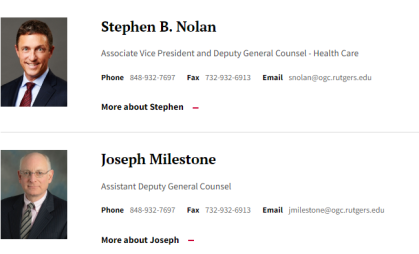
People Collection displays a vertical list of curated Person profiles. Each entry's content is associated with a Person content type and includes an optional contextual blurb and link.
Useful Tips
- Any content edits to a person's profile needs to be made on the associated Person content type.
- Be aware that edits to any Person content type will affect any instance of where that Person is used.
Live Examples
Secondary Navigation
About
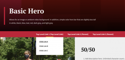
Secondary Navigation provides a full-width navigation menu that displays right below the page hero. Each parent link can be hovered to reveal additional links. This component is ideal for providing additional navigation to large sections of a site.
Useful Tips
- To create a reusable secondary navigation, first create an entry in the Paragraphs Library located at
Content > Paragraphsin the content management system. Next, add the component on a page's edit screen by selecting +From library under the Secondary Navigation section. - When adding a reusable navigation component to multiple pages, the current page will be highlighted in the menu for continuity between pages.
- If a reusable secondary navigation is not needed, select +Secondary Navigation on the page edit screen and build the component. In this case, the component can only be managed on the page it was created.
Live Examples
Special Announcement
About
Special Announcement displays a prominent call-out on the page with optional solid color backgrounds and a link.
Live Examples
- Example 1 (bottom of page)
- This page utilizes the special announcement component - See the "Core Components" tab.
About News & Events Components
Many news and events components require additional setup before being functional on pages. Browse associated demo pages to learn more about setting up taxonomy terms and working with news and event content types.
50/25/25 News Feature
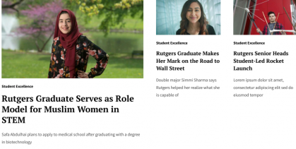
About
The 50/25/25 News Feature displays a large news feature to the left and two smaller articles to the right. Available only on the Landing: News content type.
Useful Tips
- This component only displays existing content, including Article, External Content, and Feature Article content types. Content entries need to be created before using this component.
Live Examples
50/50 Split News Feature

About
The 50/50 Split News Feature displays two news features side by side. Available only on the Landing: News content type.
Useful Tips
- This component only displays existing content, including Article, External Content, and Feature Article content types. Content entries need to be created before using this component.
Live Examples
Animated Chapter
About
Animated Chapter displays large images, ambient video, and text that scrolls up as the user scrolls down. This component can contain multiple "animation sections" to create image fade-in effects. Available only on the Feature Article content type.
Useful Tips
- This component is primarily used for lengthy, media-rich feature stories.
- The navigation title field creates an anchor link to the animated chapter. The anchor links appear at the top of the Feature Article page.
Live Examples
Events Display
About
Events Display highlights featured Event entries based on the date and sort order. This component displays one highlighted event at the top followed by up to three additional events with an optional button style link. Available only on the Alternative Home and Mini-Site content types.
Useful Tips
- To mark an existing event as featured, check the Featured box under Promotion Options on the event's editing screen. To change the order of featured events, go to
Content > Events > Sort featured events. - Once the event's date and time have passed, Events will no longer display inside this component. Event entries remain published and must be manually archived.
Live Examples
- Example 1 (bottom of page)
Filtered Events Display
About
Filtered Events Display highlights Event entries with three display options based on the event type category ID (taxonomy term) and an optional button style link.
Useful Tips
- The Listing field must be set to Events Promoter (events_promoter) on the component editing screen.
- To filter events, enter the event taxonomy ID in the Options > Argument field. Multiple taxonomies can be entered by separating each ID with a "+" (e.g. 10+22+30).
- To find the taxonomy ID, go to
Structure > Taxonomy > Event Type. The taxonomy ID is a number in the taxonomy entry's URL (e.g. /taxonomy/term/10). - The Display ID field has three options:
- Featured (displays one top featured event)
- Filtered (displays one top featured event followed by a list of events based on taxonomy ID)
- Similar (displays list of events without images based on taxonomy ID) - To mark an existing event as featured, check the Featured box under Promotion Options on the event's editing screen. To change the order of featured events, go to
Content > Events > Sort featured events.
Live Examples
Filtered News Display
About
Filtered News Display highlights News entries with three display options based on the topic category ID (taxonomy term) and an optional button style link.
Useful Tips
- The Listing field must be set to News Promoter on the component editing screen.
- To filter news, enter the topic taxonomy ID in the Options > Argument field. Multiple taxonomies can be entered by separating each ID with a "+" (e.g. 10+22+30).
- To find the taxonomy ID, go to
Structure > Taxonomy > Topic. The taxonomy ID is a number in the taxonomy entry's URL (e.g. /taxonomy/term/10). - The Display ID field has three options:
- Featured (displays one top featured news entry)
- Filtered Summaries (displays the three most recent news entries based on taxonomy ID)
- Filtered (displays the nine most recent news entries with or without a taxonomy ID) - To mark an existing news entry as featured, check the Featured box under Promotion Options on the entry's editing screen.
Live Examples
Filtered News with Feature
About
Filtered News with Feature highlights a featured News entry along with the nine most recent news entries based on the topic category ID (taxonomy term). Available only on the Mini-Site and Chaptered Page content types.
Useful Tips
- To filter news, enter the topic taxonomy ID in the Options > Argument field. Multiple taxonomies can be entered by separating each ID with a "+" (e.g. 10+22+30).
- To find the taxonomy ID, go to
Structure > Taxonomy > Topic. The taxonomy ID is a number in the taxonomy entry's URL (e.g. /taxonomy/term/10). - To mark an existing news entry as featured, check the Featured box under Promotion Options on the entry's editing screen.
Live Examples
Fourths News Feature

About
Fourths News Feature displays four news entries in a row. Available only on the Landing: News content type.
Useful Tips
- This component only displays existing content, including Article, External Content, and Feature Article content types. Content entries need to be created before using this component.
Live Examples
In the News
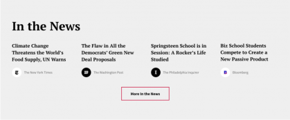
About
In the News displays up to four Media Mention entries and an optional button link. Available only on the Landing: News content type.
Useful Tips
- This component only displays existing Media Mention entries. Media Mentions are used to highlight external content and need to be created before using this component.
- The associated "In The News" Drupal view displays all Media Mentions on a dedicated page ('YourDomain.edu/in-the-news'). This view works out of the box but if you need to customize, please speak with a developer or refer to documentation.
Live Examples
News Display
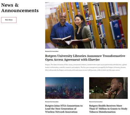
About
News Display is designed for homepages and displays up to five curated Article and External Content entries. Available only on the Alternative Home content type.
Useful Tips
- To use this component, a news homepage must be setup first (this should be a Landing: News content type).
- Featured articles are managed on the news homepage editing screen under Home Page Features.
- When adding this component to a page, make sure to correctly link your news homepage in the News field.
Live Examples
- Example 1 (bottom of page)
Tabbed News Aggregator
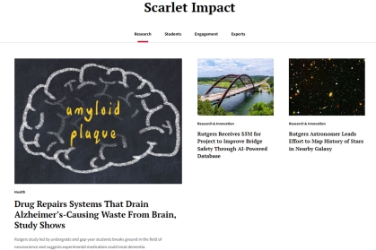
About
Tabbed News Aggregator displays curated tabs of news content. Available only on the Landing: News content type.
Useful Tips
- This component only displays existing content, including Article, External Content, and Feature Article content types. Content entries need to be created before using this component.
-
Each tab can contain any of the following components: External/Internal content types, Featured Summaries, Fourth News Feature, 50/25/25 News Feature, and 50/50 Split News Feature.
Live Examples
- Example 1 ("Scarlet Impact" section)
