Caption Title

Landing: Marketing
This is the demo page for the Landing: Marketing content type. This page template offers many media-rich components and a full-width hero ideal for marketing and promo pages.
Available Components
| Content Discovery | Interactive & Media | Text & Navigation |
|
|
|
Browse Demo Components
Below are examples of components available on the Landing: Marketing content type. By the way, this is the Heading & Description component.
50/50
The 50/50 is a basic building block for webpages. This component uses the full width of the page to showcase text on one half of the page and a large image or ambient video on the other half.

50/50 (Ambient Video)
The 50/50 is a basic building block for webpages. This component uses the full width of the page to showcase text on one half of the page and a large image or ambient video on the other half.
Enhanced 50/50
Enhanced 50/50 (e50/50) is modeled after the standard 50/50, using half of the component width for text and the other half for a visual element. Additionally, the e50/50 can display public videos hosted on Vimeo or YouTube (unlisted or private will not display), as well as Lottie animation files.
The e50/50 is intended to display video content. Images do not display correctly in the e50/50 - Please use the regular 50/50 component for static images.
Animated 50/50
Animated 50/50 provides an interactive scrolling experience ideal for displaying rich images and text with three or more 50/50 components.
50/50 #3
Lorem ipsum dolor sit amet, consectetur adipiscing elit. Nullam in metus vitae ex condimentum molestie. Phasellus at dolor cursus, tristique justo eu, vestibulum arcu. Vivamus. Lorem ipsum dolor sit amet, consectetur adipiscing elit.



Photo Feature: 2-Column
Photo Feature: 2-Column

Headline 1
Photo Feature: 2-Column displays a prominent image and bold content as users scroll down the component. This component has text and links on one side and an image with a caption area on the other side.
Headline 2
Lorem ipsum dolor sit amet, consectetur adipiscing elit. Nullam in metus vitae ex condimentum molestie. Phasellus at dolor cursus, tristique justo eu, vestibulum arcu.
Description & Card Carousel
Description & Card Carousel displays up to three content items at a time with optional arrows to rotate through additional sets of content.
Featured Summaries
Featured Summaries displays content in rows of three blocks. Each block contains a heading, description, image, and optional link.

Image Card 1
Lorem ipsum dolor sit amet, consectetur adipiscing elit. Nullam in metus vitae ex condimentum molestie. Phasellus at dolor cursus, tristique justo eu, vestibulum arcu. Vivamus.
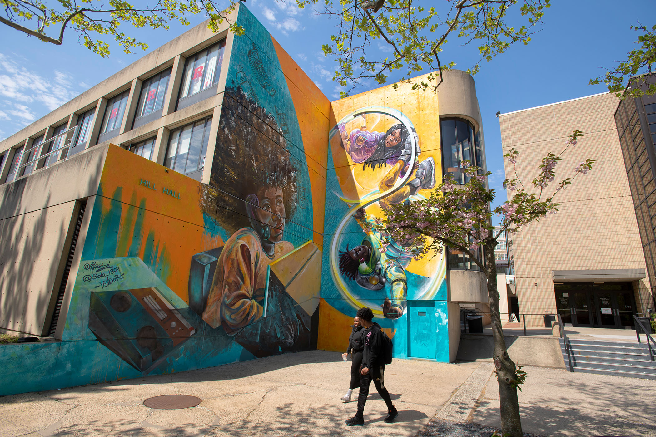
Image Card 2
Lorem ipsum dolor sit amet, consectetur adipiscing elit. Nullam in metus vitae ex condimentum molestie. Phasellus at dolor cursus, tristique justo eu, vestibulum arcu. Vivamus.

This article can be displayed on pages using various news display components or the Feature: Internal Content component. When using the 'Headline Only Hero', make sure to add a Promotional Image. Promotional Images will display when an article is viewed inside components or on news listing pages.
Facts & Figures
Facts & Figures displays statistics and other key pieces of information with bold text, optional button style link and background color options.
Filtered News Display (Filtered)
Full Width Video Headline
Full-Width Video displays a remotely hosted video with an optional headline and description that spans the width of the screen. Videos must first be added to your content management's media library as "Remote Video" type before they can be used inside this component.














Social Media Component
Follow Us