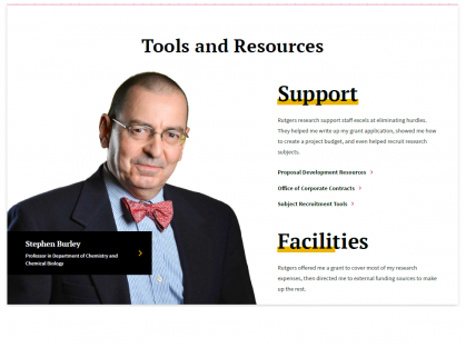
Photo Feature: 2-Column
See the Component in Action

About the Photo Feature: 2-Column
Add Descriptive Links on the right with titles that have a yellow highlighted underline and text scrolls up as the user scrolls down. The text on the right and the caption area offer the ability to include links.
Creating a Photo Feature: 2-Column
- Headline is a required field
- The black flyout caption box over the image cannot be disabled and has a required heading.
- Caption box has optional description and link
- On the right side of the component, each heading functions as an individual "descriptive link" element.
- The text editor for this element is limited to basic styling, it cannot take images or advanced formatting.
- Optional CTA links are available
- The image defaults on the left side of the component; it can be flipped to display on the right side.