


Landing News CT
See the News Landing Page In Action


Available Components on Landing: News
Featured Summaries
Featured Topic
Featured: External Content
Featured: Internal Content
In the News
Fourths News Feature
50/25/25 News Feature
50/50 Split News Feature
Filtered News Display
Social Media
Feature Videos
Tabbed News Aggregator
Heading and Description
Managing the Landing News Page
On this page, you'll be able to pull in existing content using "Feature: Internal Content" or create new in-place cards using "Image Card: Curated" cards. All cards display an image, title, optional summary. Summaries are added within existing content in the "summary" field.

In the admin menu go to, structure > block layout, https://[yourdomain]/admin/structure/block.
To add pages, such as about or subscribe links, etc, in the admin bar, go to structure > menu > news landing, https://[yourdomain]/admin/structure/menu/manage/news-landing?destination=/admin/structure/menu. Click on the blue "Add Link" button and add the link name and the URL or find the page you want to link to. Hit save.
In the admin menu, go to structure > menu > topics menu, https://[yourdomain]/admin/structure/menu/manage/topics?destination=/admin/structure/menu.
Research Awards
This is a summary. Note: A promotional image isn't necessary when using the hero - with headline on image. The image used in the hero will be automatically pulled into components where this article is pulled into.

This is a summary. Note: A promotional image isn't necessary when using the hero - with headline on image. The image used in the hero will be automatically pulled into components where this article is pulled into.
Filtered News Display

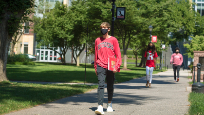
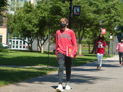
The Emmy Award-winning actress and alumna encouraged members of the Class of 2023 to chase their dreams and find their voice in a passionate speech that started with her singing and taking a selfie with the crowd.
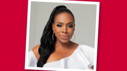
In a special graduation feature, senior Kara VanDooijeweert interviewed commencement speaker and Emmy-winning alumna Sheryl Lee Ralph about how her time at Rutgers shaped her career.
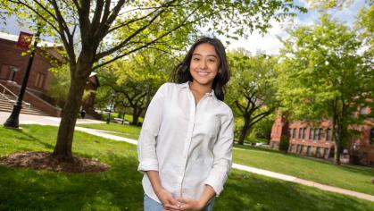
This summer, with a bachelor’s degree in public policy and economics in hand, Sara Rubiano will start working as a private banking analyst at JPMorgan’s International Private Bank.

Featured Topic (Title) - Use this component to showcase up to two articles
Fourths News Feature Component
See the Fourth News Feature component below. | This component can bring in "Feature: External Content" and "Featured: Internal Content". This component does not have a title. To display a title, use the Heading and Description component above it. You can add a title only or a description. Remember that in this Heading and Description component you can hide the title, if you just want to show text in the component, without a title.


This would be a summary.

Add a summary here. Headline 255 character limit. Use this to create links to external content, so that it can function link it's internal to your site. In this example, I am creating a content card, which is a set of content that contains a headline, an image, a topic tag/category/eyebrow, and a link. This content card can be called into various components similar to other internal CTs like articles.

This is a summary. Note: A promotional image isn't necessary when using the hero - with headline on image. The image used in the hero will be automatically pulled into components where this article is pulled into.
50/50 Split News Feature
See the 50/50 Split News Feature component below. This component shows two large articles at 50% of full-page width side-by-side. To add content, pull in "Feature: External Content" and "Featured: Internal Content". This component does not have a title. To display a title, you can opt to add a Heading and Description component above it, as you see here. You can add a title only or a description. Remember that in this Heading and Description component you can hide the title, if you just want to show text in the component, without a title.
This is a summary. Note: A promotional image isn't necessary when using the hero - with headline on image. The image used in the hero will be automatically pulled into components where this article is pulled into.
This is a summary. Note: A promotional image isn't necessary when using the hero - with headline on image. The image used in the hero will be automatically pulled into components where this article is pulled into.
50/25/25 News Feature Component
See the 50/25/25 News Feature component below. | This component can bring in "Feature: External Content" and "Featured: Internal Content". This component does not have a title. To display a title, a Heading and Description component above it. You can add a title only or a description. Remember that in this Heading and Description component you can hide the title, if you just want to show text in the component, without a title.
Add a summary here. Headline 255 character limit. Use this to create links to external content, so that it can function link it's internal to your site. In this example, I am creating a content card, which is a set of content that contains a headline, an image, a topic tag/category/eyebrow, and a link. This content card can be called into various components similar to other internal CTs like articles.
This is a summary. Note: A promotional image isn't necessary when using the hero - with headline on image. The image used in the hero will be automatically pulled into components where this article is pulled into.
Tabbed News Aggregator - Title
To Tabbed News Aggregator you can add the following components within each tab.
Featured: External Content
Feature: Internal Content
Featured Summaries
Fourths News Feature
50/25/25 News Feature
50/50 Split News Feature
This is a summary. Note: A promotional image isn't necessary when using the hero - with headline on image. The image used in the hero will be automatically pulled into components where this article is pulled into.
Filtered News Display - Test for All


Courtney Bryan, whose socially conscious work is steeped in jazz, classical, and sacred music, studied jazz piano performance at Mason Gross School of the Arts.

The Emmy Award-winning actress and alumna encouraged members of the Class of 2023 to chase their dreams and find their voice in a passionate speech that started with her singing and taking a selfie with the crowd.
In a special graduation feature, senior Kara VanDooijeweert interviewed commencement speaker and Emmy-winning alumna Sheryl Lee Ralph about how her time at Rutgers shaped her career.
This summer, with a bachelor’s degree in public policy and economics in hand, Sara Rubiano will start working as a private banking analyst at JPMorgan’s International Private Bank.

Rahul Rana discovered a passion for entrepreneurship and cutting-edge technologies during his first year at Rutgers Business School and ran with it.